🔬 Pass Maps 2.0
Network analysis has been used to break down football matches for a couple of years now, resulting in the rise of the pass map. The pass map is a tool that displays the most important passing connections, the intensity of passing between players and (currently) a players’ average passing position. In this post I show you my take on improving the pass map by utilizing cluster analysis to better represent players’ actual passing positions within a team.
In 2012 Peña and Touchette (pdf) showed that by using metrics such as PageRank, Closeness and Betweenness it is possible to identify important players within such network. Besides the use of mathematics they also showed a visual representation of what a passing network looks like (see Figure 1).
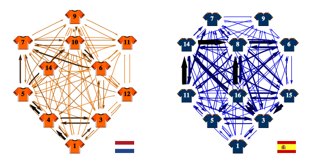
Although this image gives a clear representation of the most utilized passing lanes the players’ positions displayed are fixed and only corresponding to the players’ formation on paper.
A couple years later these maps have evolved into pass maps such as those created by 11tegen11 (see Figure 2). Although these maps already give a better indication of player location and pass intensity there are still some fundamental flaws that make these images difficult to interpret.
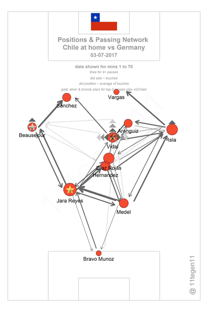
I will not go into the details of all of them here since Jan Mullenberg already summed it up very nicely in his blog post appropriately named The Sense and Nonesense of a Passmap. The gist of this piece is that there are two main flaws, namely: passing direction as indicated by the arrows is not the true passing direction/average passing direction of that player, and secondly (the problem I will address in this blog) the average pass position shown can be very unreliable especially for players that change positions a lot. Mullenberg gives the following example:
Pass Map 2.0
Circumventing the issue of average pass position can be achieved by applying a cluster analysis on the passes created by each player individually. Simply put, a cluster analysis looks at all passing coordinates (x,y) for a given player and decides which of these points belong to the same group (or cluster) and which points belong to a different group.
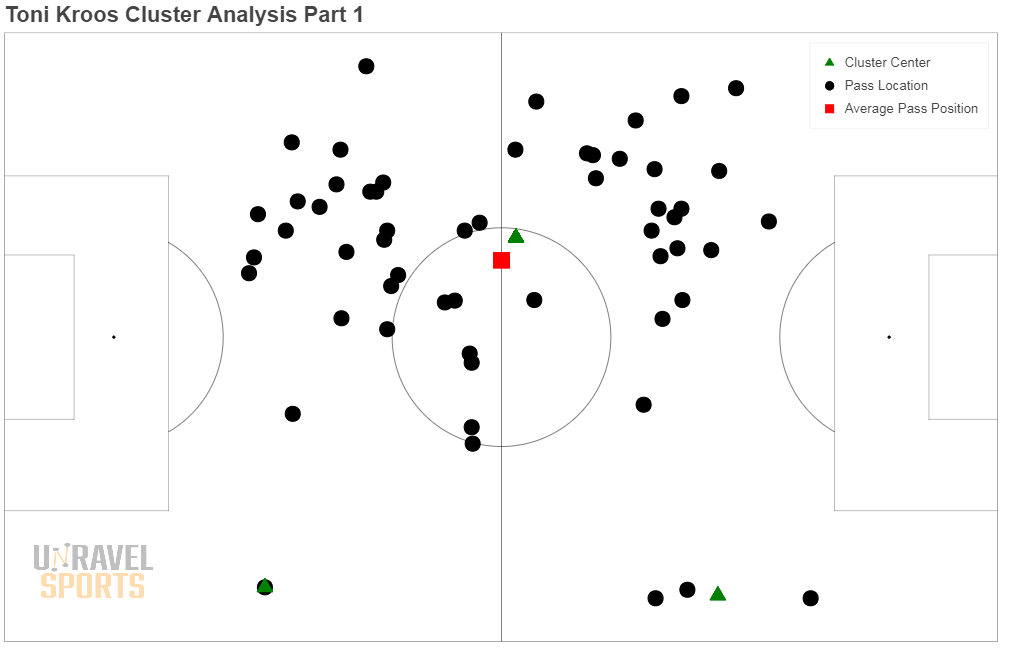
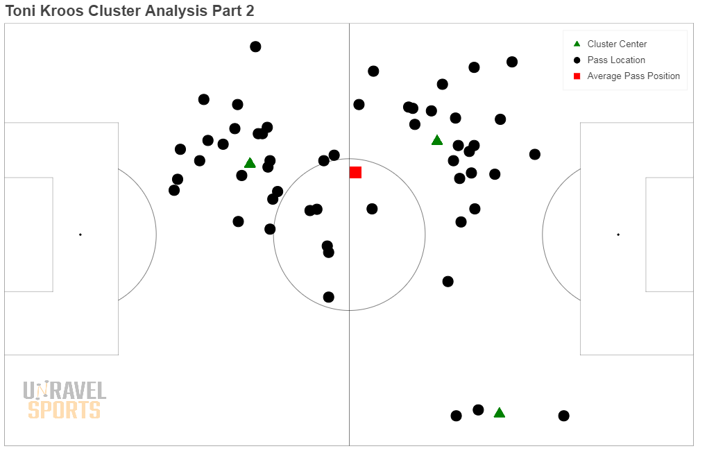
In Figure 3 we see a all passes made by Toni Kroos at Real Madrid in the match against Barcelona. The algorithm identifies three clusters (the cluster centers are indicated with triangles). To make this clustering more fitting we omit every cluster of size 1, as we can consider them outliers. Subsequently we rerun the algorithm (see Figure 4) and we can now clearly see that Kroos his passes are divided up into 3 clusters, a small cluster on the right flank, one on his own half and another large one towards the left flank. We can now use these three cluster centers to represent Toni Kroos three times on the same map, more accurately displaying his passing locations than the average passing position (red square) would have.
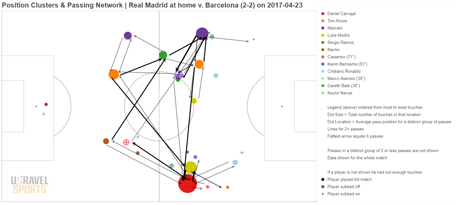
The new pass map for Real Madrid against Barcelona can be seen in Figure 5 (click the image to enlarge it). We see the cluster centers of Toni Kroos represented in orange with the size of the nodes representing the number of passes. In this image we can also clearly see the example of what Jan Mullenberg hinted at with his example of Ronaldo and Bale. Both Ronaldo (light blue) and Bale (green with cross) now have two dots on the map, one on the left and one on the right flank.
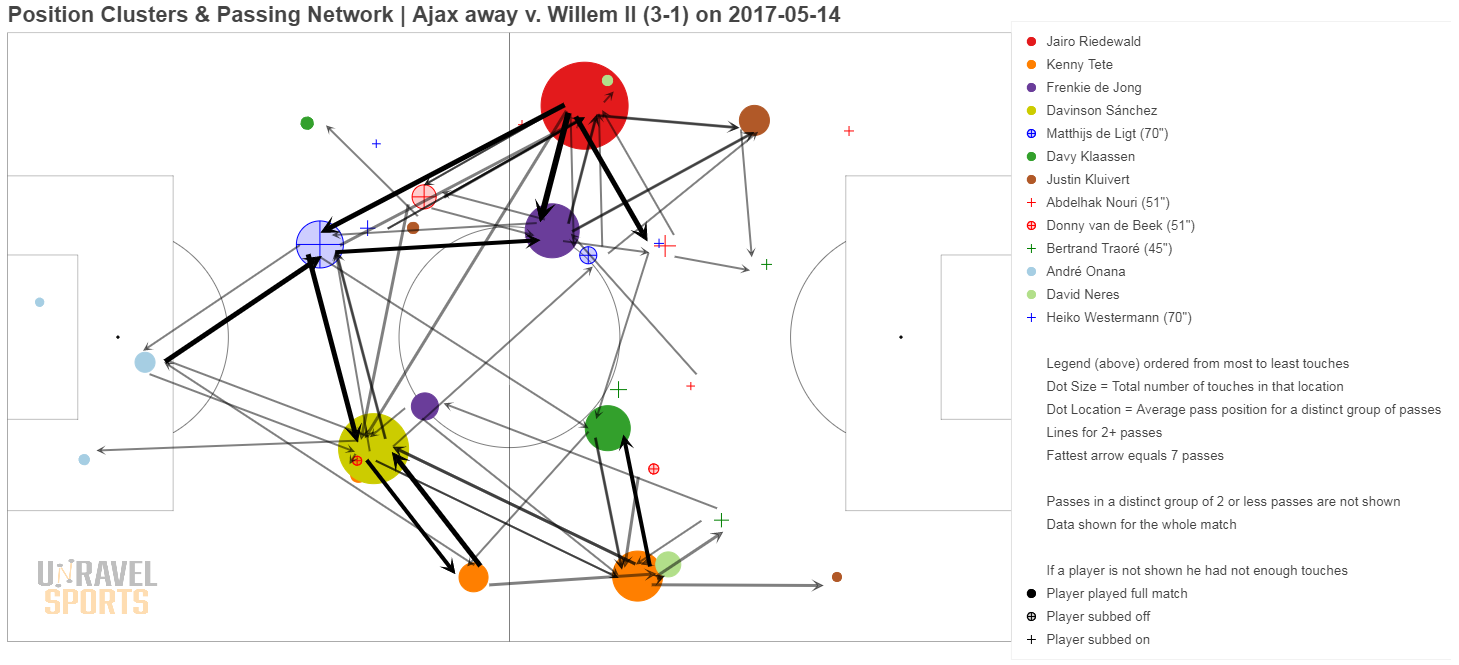
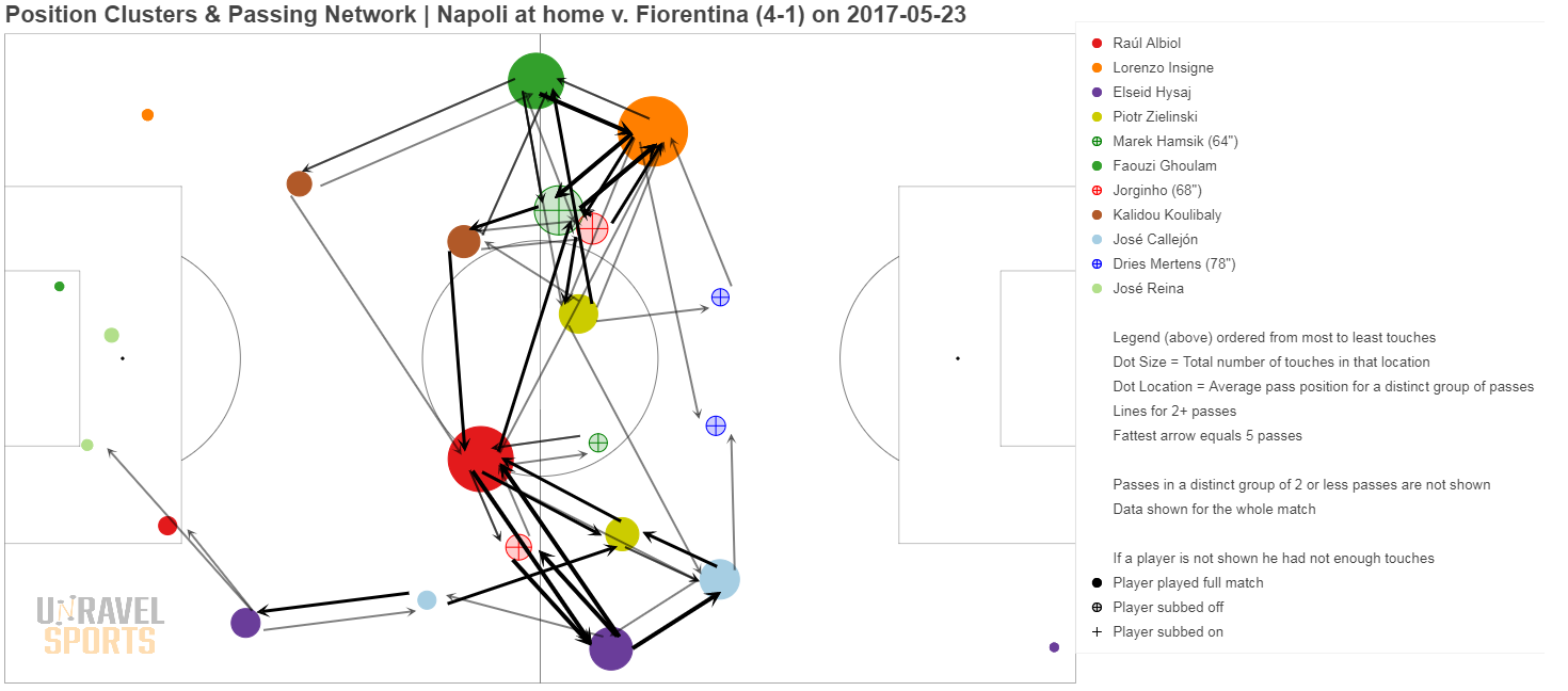
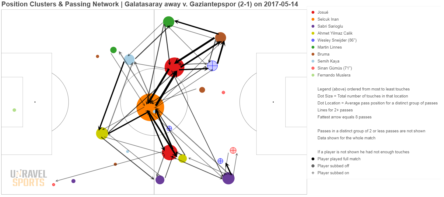
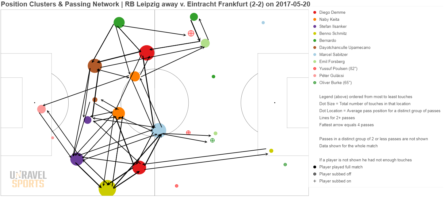
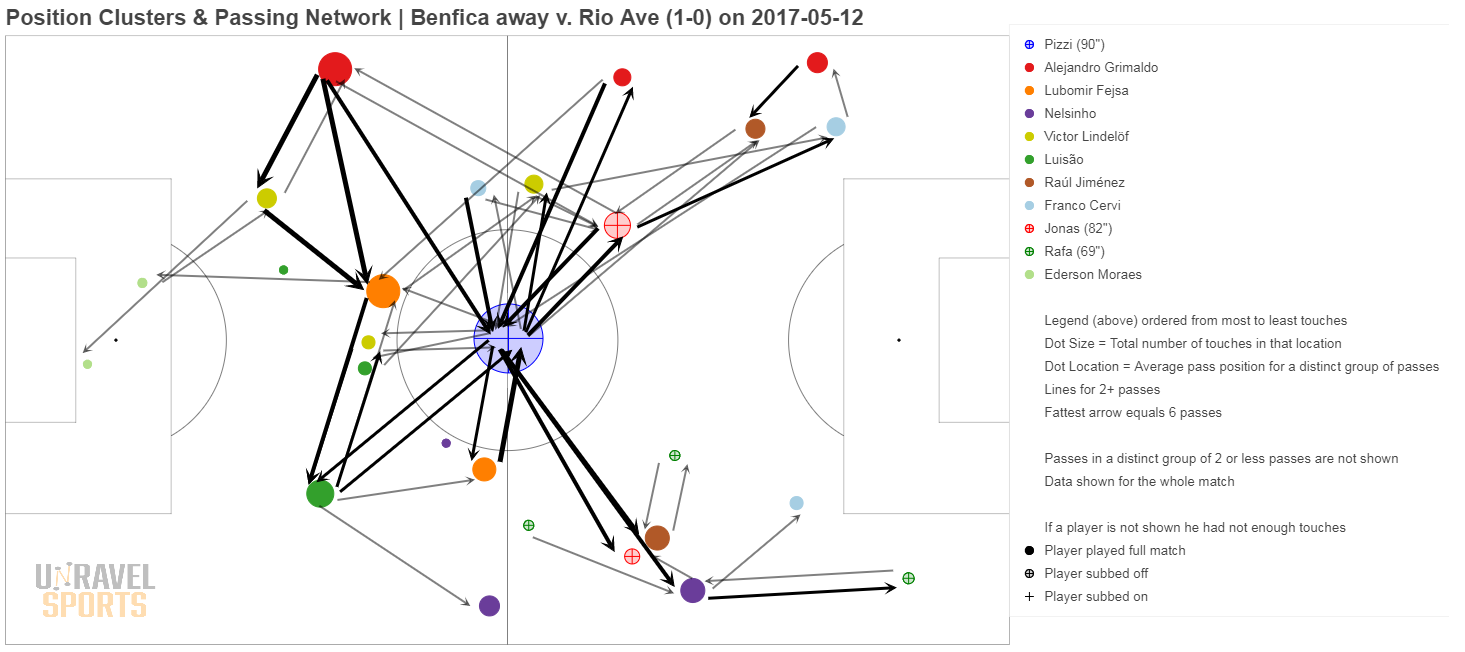
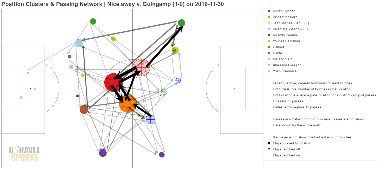
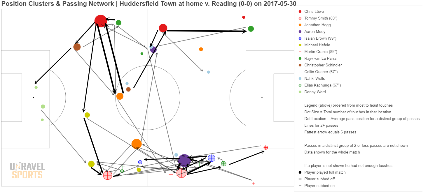
Examples